


.png)

.jpeg)


.jpeg)


.jpeg)


.webp)


.png)

Webinars are everywhere right now—and for good reason.
They’re a powerful way to connect, teach, and share value in real time. But even the most exciting webinar topic won’t get far without the right promotion.
That’s where webinar emails come in. Whether you’re planning your first online event or looking to boost attendance for your next session, getting your emails right is a crucial step.
In this guide, I’ll walk you through exactly what works (and why), and share real examples from too B2B SaaS companies to inspire your next send.
Let’s make your next webinar invite your best one yet.
How to craft an irresistible webinar email
A great webinar email starts with clarity, relevance, and a clear promise of value. Your webinar invitation email should lead with a strong, benefit-driven webinar title—something that instantly answers “Why should I care?” Add a brief description that teases the content without overwhelming, followed by bold, well-placed call to action buttons to register.
The top-performing emails (like those from Loom, Zapier, and Grammarly) use clean layouts, highlight key points with bullet points, and make the registration link impossible to miss. Including a headshot or short intro from the webinar host can add a human touch.
It’s also smart to hint at exclusive content, valuable insights, or even a replay option, especially if it's a free webinar. Whether you use plain text or a polished email template, make sure it’s visually cohesive and aligns with your brand. The goal? Make your invite email feel like a personal nudge, not a mass blast.
Make reminder emails work smarter, not harder
You’ve sent the invite—now it’s time to remind people. Reminder emails are key to boosting attendance, especially as your upcoming webinar draws near. Timing is everything. I usually send one 24 hours before, and another a couple hours ahead of the session. Just enough to nudge, not nag.
Keep your email content short and helpful. Reconfirm the event details—think webinar topic, date, start time, and a clickable registration link in case they still need to register. A quick brief introduction from the webinar host can add a personal touch and increase trust.
Try subject lines that are clear, timely, and benefit-driven—think along the lines of what's in it for the reader. And if you’re targeting different segments, tailor the reminders based on interests or stage in the funnel.
Done right, reminder emails don’t just increase conversion rates—they help people actually show up and engage in your best webinar yet.
Follow up email tactics that keep attendees engaged
The follow up email is your chance to continue the conversation and deliver real value. Whether you're writing to webinar attendees or no-shows, this is where the relationship deepens. Start by expressing gratitude—thank them for joining your recent webinar, or let them know you missed them if they couldn’t attend live.
💡 If your webinar brought in leads, this is also a golden moment to move them down the funnel—consider offering a free trial, discount, or a valuable resource tied to your product. One small incentive can spark real action.
Then, get into the good stuff. Share a recording link, your key takeaways, and any additional resources like slides or links. Don’t forget a quick note requesting feedback—it helps shape your future webinars.
I actually wrote a full article just on webinar follow up emails with examples as well, so feel free to check that out too!
20 examples from the best B2B companies
Calendly – Polished and benefit-driven

Calendly’s webinar invitation email nails the first impression with a benefit-driven webinar title and a bold CTA that instantly pops. It gives a clear brief description of the upcoming event, outlines key points with bullet clarity, and emphasizes value for sales teams.

The reminder email is short and sharp, reinforcing the webinar topic and spotlighting answers to common questions. Plus, the “register anyway” nudge ensures nobody misses out, even if they can’t attend live.
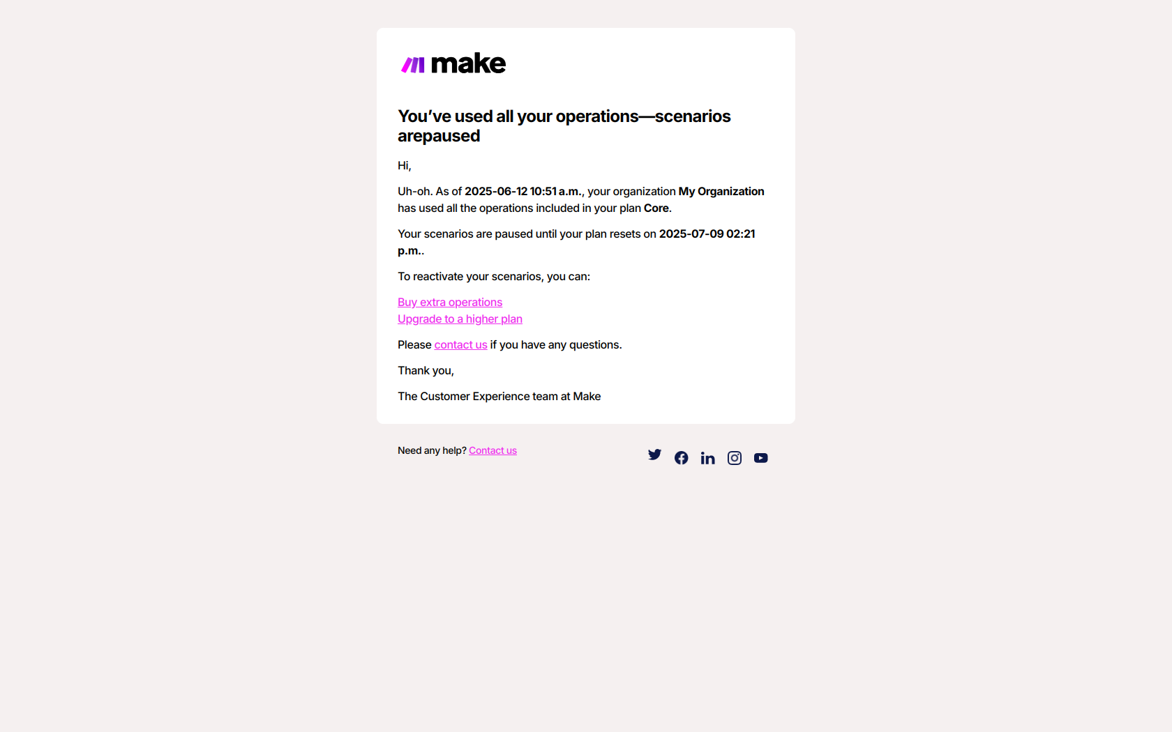
Loom – Personal, product-focused pitch
Loom’s webinar invite leans into clarity and relevance, starting strong with a benefit-packed headline and a friendly, no-fluff description. It quickly conveys what attendees will learn, from training efficiencies to automated AI workflows, with clean bullet points and a personal touch.
A video teaser adds visual appeal and builds excitement. Plus, the laid-back tone (“We don’t force live meetings”) makes it approachable. The “register anyway” fallback ensures they capture leads—even from busy folks.
Slack – Expert-driven invitation email

Slack keeps it polished and professional with clear, benefit-driven messaging. The initial invite sets the tone with a bold headline, a strong expert profile (Franny Hsiao, PhD), and solid reasons to attend—trustworthy AI, transparency, and guardrails for deployment.

The reminder email sharpens focus, echoing the core value props in tighter language. Clean visuals, consistent branding, and a strong register-now CTA help build trust while making it super easy to commit—live or recorded.
Grammarly – Best webinar email?

This one is my favorite! Grammarly’s invite is sleek, smart, and data-driven—just like their brand. It opens strong with compelling stats (AI users are 80% faster!) and a catchy webinar title: Trailblazers of Transformation.
The email balances authority (big names like Smartsheet and The Harris Poll) with actionable promises, like scaling AI fluency and boosting team performance. The “Secure Your Seat” CTA pops, while the soft “Register anyway” for the replay keeps FOMO in check. Clean layout, clear value. Nailed it.
Zapier – Simple, clear call to action

Zapier keeps it simple and snappy—just like their workflows. The bold headline asks a direct question, creating instant relevance for productivity-focused readers. “Zapier 101” is a smart title, signaling it's beginner-friendly.
The benefits are clear: build workflows, adapt to your needs, boost output. The design’s clean with consistent CTA placement (“Save your spot” x2), and a friendly nudge for replay access keeps it inclusive. It’s practical, confident, and zero fluff—very on-brand for Zapier.
Webflow – Visually polished layout
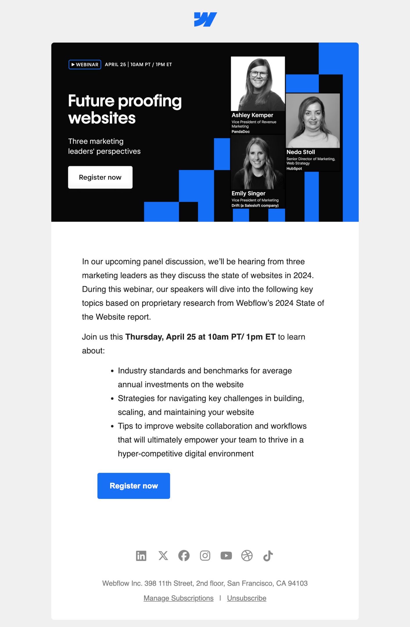
Webflow goes bold and clean with their design, mirroring the product’s vibe. The title “Future proofing websites” is punchy, and the subtitle “Three marketing leaders’ perspectives” adds authority. The content is crystal clear—panel format, expert insights, and juicy takeaways like benchmarks, scaling strategies, and team empowerment tips.
Dual CTAs (“Register now”) keep conversions top of mind. It’s sharp, informative, and visually tight—just like a high-performing website should be. Webflow walks their talk here.
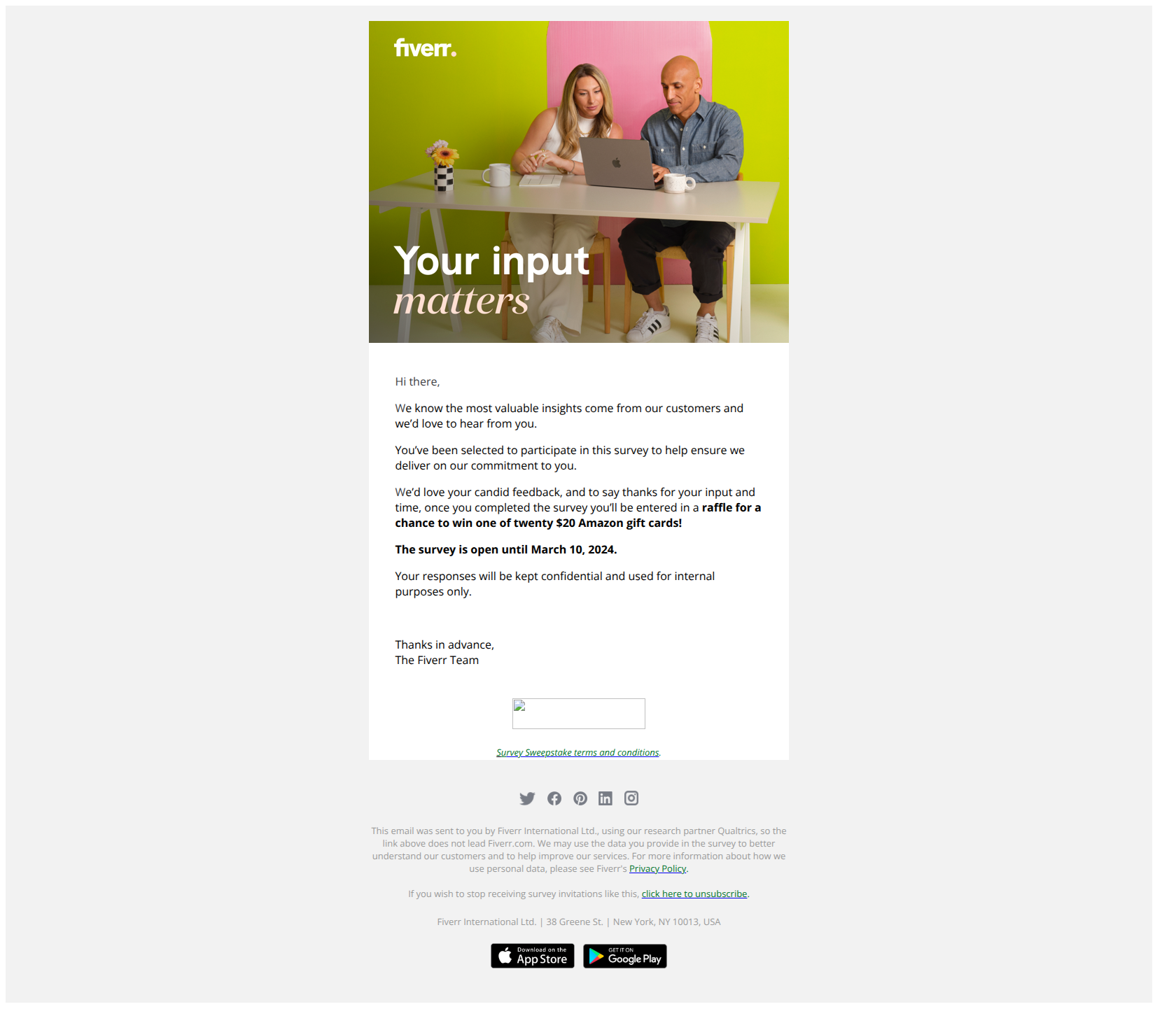
Fiverr – Curiosity fuels clicks

Fiverr nails the intrigue factor with “influencers you can’t tell are AI”—hello, curiosity! The subject is timely, bold, and just edgy enough to spark clicks. The layout is crisp: strong headline, speaker credibility, and clear what-you’ll-learn blocks (love those icons!).
It teases just enough details—ethics, artistry, biz impact—without overwhelming. The “Save my spot” CTA pops, and the whole thing feels futuristic yet grounded. Smart, sleek, and spot-on for a topic that’s pure headline bait.
Customer.io – Friendly reminder flow

Customer.io’s sequence is tight, clean, and user-focused. The first email grabs attention with a playful “data do’s and don’ts” hook, a sneak peek visual, and a solid incentive (free lunch? yes, please).


The reminders get progressively more concise: one gives a friendly “see you tomorrow,” the next is straight to the point with a “webinar in 1 hour” nudge and access link. The tone stays warm and helpful—without overdoing it. Solid pacing, great clarity, no fluff.
Braze – Crisp and compelling

Braze goes bold and bright with a vibrant hero image and a snappy title: Turning Metrics into Momentum. The copy smartly frames the pain point—too much data, not enough insight—then promises actionable value.
Three key takeaways are neatly bullet-pointed, and the speaker section adds a human touch. The CTA is loud, clear, and repeated twice. It’s simple, confident, and effective. Just one email, but it delivers clarity, energy, and plenty of “what’s in it for me.”
Ahrefs – Casual yet complete

This Ahrefs invite is short, sweet, and bursting with personality. It kicks off with emojis, casual tone, and bolded webinar name—setting a playful yet clear vibe. The hero image feels approachable with a friendly face and vibrant branding.
Copy quickly explains the value (Ahrefs core tools) and hits key pain points like SEO issues and niche content. A single orange CTA button stands out perfectly. It’s efficient, friendly, and gets the job done—just like Ahrefs.
Lemlist – High-energy email template

Lemlist nails the balance of practical and personable in this webinar sequence. The invite kicks things off with a relatable challenge and solid social proof (Sam’s 220K+ followers), instantly building trust.
Key benefits are clearly laid out and echoed again in the confirmation email, which helpfully includes calendar links to lock in attendance. The reminder keeps up the energy with visual bullet points, urgency, and a bold red CTA.

That said, there are slight design discrepancies between emails in the sequence—differences in formatting, spacing, and visual style that stand out.

Maintaining consistency across reminders is important for a cohesive brand experience, and tightening that up would help these already strong emails feel even more polished.
Lucid – Eye catching desing

Lucid’s invite is crisp, professional, and confidence-driven—just like its brand. The subject line teases exclusivity (“Announcing Lucid’s future”), while the subheader reinforces value with product updates and training.
Regional time zones add a global touch, and the benefits are laid out with arrow icons that visually guide the reader. Two identical CTAs provide multiple engagement points. The “Still register” note smartly captures fence-sitters. Overall: clean design, strong clarity, and a no-fluff invitation for busy professionals.
Pipedrive – Relevance meets clarity

Pipedrive nails a clean and conversational invite with a no-fluff tone that speaks to modern sales challenges. The subject line promises revenue growth (yes, please), and the body empathizes with the reader’s confusion around AI, team shifts, and selling tactics.
Bold text highlights urgency (“a must for sellers, managers…”), while the CTA—“Grab a spot”—feels casual yet urgent. Visuals are simple and friendly, and the pacing is spot-on. It’s clear, relevant, and
Drip – Urgent and human

Drip’s email gets straight to the point with urgency and clarity. The hook? Profitability is under pressure, and they’ve got insights to help. The tone is personal and casual (we love the 👀 emoji), making the reader feel like they’re getting insider info.
The bullet points keep it scannable, and the CTA—“Save your spot now”—pops in bright pink. It’s warm, relevant, and refreshingly human, all while staying laser-focused on value and outcomes.
Beehiiv – Lineup of free webinars

Beehiiv nails the value-packed roundup vibe with this clean, skimmable event digest. Each webinar card is visually distinct and clearly explains what you’ll learn—whether it’s launching, growing, or automating your newsletter.
The tone is friendly and inclusive (“whether you’re just starting out or experienced”), and the RSVP links are placed right where they should be. It’s a one-stop shop for newsletter builders, full of momentum and easy decisions. One email, seven reasons to RSVP.
Surfer – Great value, off spacing

Surfer’s webinar invite delivers a strong value proposition—helping users optimize content for better rankings—and it’s smart to use a live session to walk through key features and answer questions in real time.
The message is clear and the content is structured to highlight what’s in it for the reader. That said, while the concept and copy are solid, the design could use a bit more polish. The spacing feels off in places, which slightly disrupts the visual flow. Overall, it’s a good email with room for visual improvement.
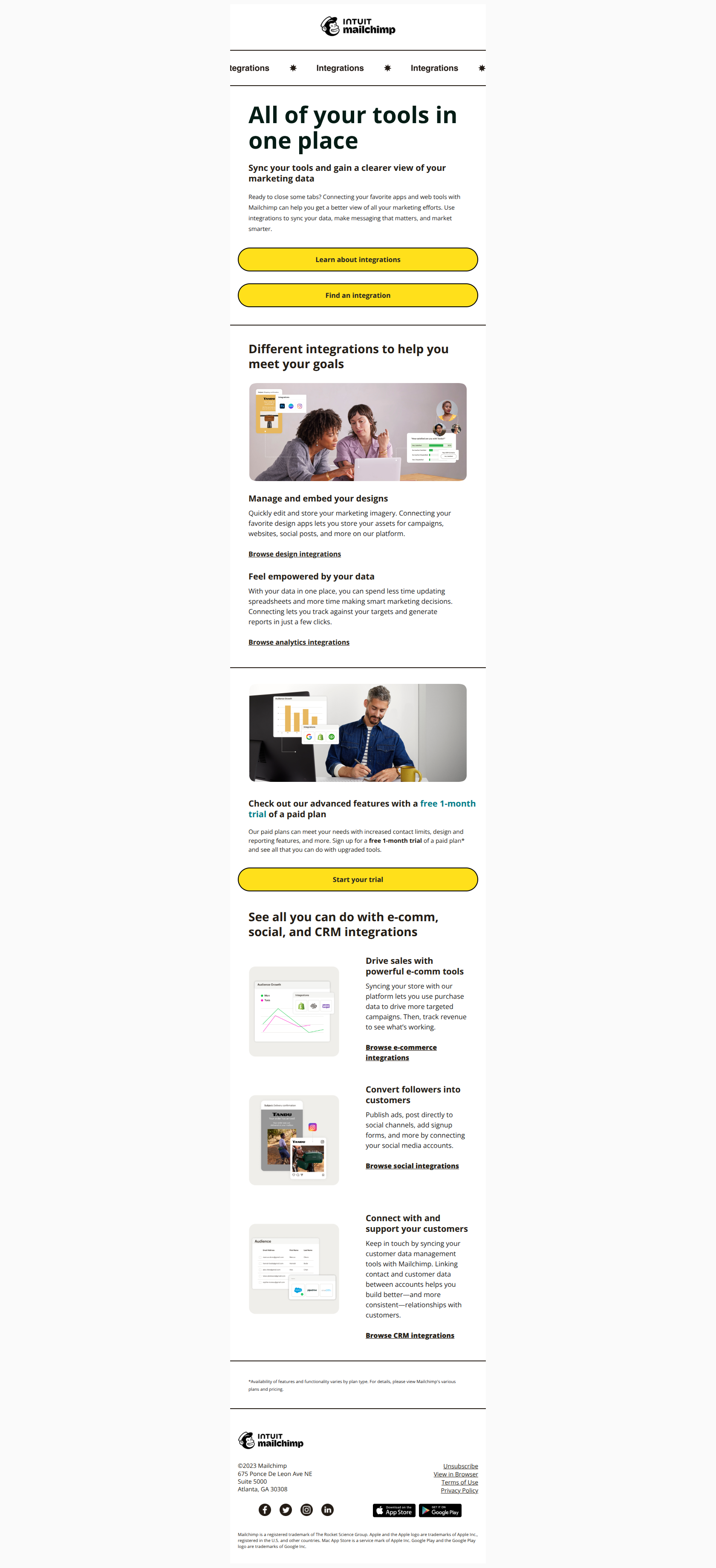
SEMrush – Timely and tactical

SEMrush nails the seasonal angle with a timely, pain-point-driven email. The bold purple header grabs attention, and the title clearly sets expectations. It speaks directly to marketers tired of slashing prices, offering solutions that feel relevant and valuable.
The bullet-point benefits are quick to scan and emoji-enhanced for a fun touch. Repeating the CTA keeps things focused, and the friendly sign-off ties it all together. It's a polished, purposeful invite that balances urgency with expertise.
Gong – Refreshing plain text

Gong takes a refreshing route with a plain text-style email—standing out from the sea of polished HTML designs. It feels more human, like a personal note from Dylan rather than a marketing blast. The message is clear, benefit-driven, and low on fluff, making it easy to digest.
The casual tone and direct CTA work well for busy sales teams. It’s a smart experiment—an A/B test against a designed version could reveal some fun insights.
OptinMonster – Feature-led replay reuse

OptinMonster smartly recycles a past webinar to spotlight how its personalization features actually work—great move for showing value without needing a live session. The email breaks down tactics clearly (like Smart Tags and Geolocation) and gives a solid preview of what you’ll learn.
That said, it’s a bit on the long side. A tighter format or trimmed-down version might help keep attention all the way to the end, especially for busier readers.
Google Workspace – Engaging webinar preview

This email from Google Workspace keeps things clean and to the point—just like you’d expect. The visuals do a solid job showing Gemini in action across Chat and Meet, which helps make the abstract feel real.
The copy is brief but effective, positioning the webinar as an exclusive peek into “collaboration superpowers.” It’s not flashy, but it doesn’t need to be. Overall, a strong, on-brand invite that knows exactly what it wants you to do: register.
Pulling it all together: email content that converts
💡 Your webinar email funnel should feel seamless—from the invite to reminder emails to the final follow up email. Keep your email content focused, benefit-driven, and easy to act on. Segment your audience when possible, and use templates that speak to different interests.
Highlight key points, link directly to the webinar registration, and don’t forget to add value at every touchpoint. A smooth flow keeps your readers engaged—and your conversion rates heading in the right direction.
From invite to insight – mastering your webinar email game
From crafting your first webinar invite to sending thoughtful webinar follow up emails, every message plays a part in creating an engaging webinar experience. Use each webinar email to build connection, deliver valuable content, and guide your attendees toward real action.
Whether it’s a future webinar or a product trial, keep the momentum going. And hey—if you ever need further assistance with strategy or execution, I’m here to help you create emails worth opening (and clicking).
.png)


