


.png)

.jpeg)


.jpeg)


.jpeg)


.webp)


.png)

Welcome emails set the tone for your entire onboarding experience.
It’s often the first moment a new user hears from you post-signup, and that first impression carries a lot of weight.
This guide breaks down what makes a great welcome email—from structure and tone to timing and content.
Whether you're polishing your onboarding flow or building one from scratch, you’ll find real-world examples, practical tips, and ideas you can put into motion right away. No fluff—just what works.
Welcome emails in the customer onboarding process
Welcome emails are foundational to your customer onboarding process.
This first touchpoint sets the tone for everything that follows, guiding new users from sign-up to meaningful engagement. Done right, it’s your product’s handshake: clear, confident, and welcoming.
For SaaS teams, especially those with a product-led approach, a great welcome email can accelerate time to value. It bridges the gap between acquisition and activation, introducing your product’s environment, next steps, and key features.
It's also your chance to affirm the user's choice and open the door to deeper behavior based emails later in the journey.
This email doesn't need to sell—it needs to guide. A focused message, a strong call to action, and timely delivery can drive immediate exploration and create a sense of momentum. Think of it as the first step in a larger lifecycle flow, not a standalone moment.
And yes, templates help—but even the best email templates need to feel intentional. When your welcome email aligns with your onboarding goals and speaks directly to your new customer, you're not just saying "hello"—you’re saying “let’s go.”
Helping new users feel at home from day one
Making new users feel at home is about removing friction.
From the very first email, your tone, structure, and content should feel like an extension of your product: clear, helpful, and ready to support.
This welcome message should instantly signal, “We see you. Here’s what to do next.” Use a clear call to action—ideally one that leads users toward a quick win.
Whether that’s starting a project, setting preferences, or exploring a dashboard, the goal is to show progress immediately.
It’s also smart to preview what’s coming next. Are there email templates, guides, or in-app nudges in their future? Set expectations while keeping things light.
💡 Avoid cramming in too many key features upfront. This email isn’t about showcasing everything—it’s about giving users a reason to come back. One or two meaningful actions are more effective than a full feature tour.
You’re welcoming a real person, not just a sign-up. So write like it. A little warmth, a dash of personality, and one behavior-based nudge is often all it takes to shift a passive reader into an active new customer.
Communicate your product's core value clearly
The best SaaS welcome emails surface your product’s core value in seconds.
That value should be front and center, not buried beneath generic copy or overly enthusiastic greetings. Remember: your new customer signed up for a reason—now’s the time to validate that decision.
Use plain language that reflects real outcomes. “Save time on reporting,” “Automate repetitive tasks,” “Connect with leads faster”—concrete value statements outperform abstract promises every time.
This email should not be a product tour in disguise. Instead, focus on reinforcing a single, compelling benefit. You can link to more in-depth content later via behavior based emails, but the first step should be instantly scannable and actionable.
Great email templates lead with value, not features. That’s a key distinction. You're here to solve a problem, not list product specs.
Use visual hierarchy to guide the reader: headline = value, subhead = how, CTA = let’s go. And if you want to spotlight a feature, make sure it directly supports that core value.
Clarity creates momentum. If your user knows exactly why they’re here and what your product can help them achieve, they’re far more likely to stick around and explore further.
Introducing key features without overloading
The temptation to show off every shiny part of your product is real—but resist it.
Your welcome email should spotlight key features strategically, not cram them all into one scroll.
Think of this first email as a teaser trailer, not a full demo. Highlight one or two features that deliver immediate value to new users.
What gets them to their first “aha”? What supports your core value without needing setup, support, or explanation?
This is where smart segmentation and behavior based emails can take the load off. If you know what kind of user signed up—marketer, founder, ops lead—you can tailor which features you introduce first, and which come later.
Use email templates that balance visual clarity with concise messaging. A short bulleted list, quick animations, or GIFs can show value without making the email feel like homework.
Every feature you mention should link to one focused action. Whether it's "try it now," "set it up," or "learn more," make the call to action clear and immediate.
Overloading your new customer on day one is the fastest way to freeze engagement. Show just enough to spark curiosity, then let your onboarding flow do the rest.
Behavior based emails that evolve with your user
Behavior based emails are your secret weapon for staying relevant as your user evolves.
Rather than sending the same static messages to every new customer, these emails adapt—triggered by real user actions, not arbitrary timelines. They turn your onboarding process into a dynamic, personalized journey.
Whether it's a first login, feature skipped, or trial halfway mark, behavior-based triggers help you guide users at the right time with the right message. This keeps momentum high and reduces drop-off.
Welcome emails kick things off, but they shouldn’t be the only touchpoint. A well-timed follow-up email that surfaces new features or celebrates progress can deepen engagement. Use behavior data to deliver value—suggest templates after a user sets up a project, or invite collaboration once a teammate is added.
The real magic lies in how these emails grow with your customer. They start simple and evolve into a relationship-building channel.
They nudge, guide, and respond, creating a loop that mirrors how your users actually experience your product.
When done right, behavior based emails feel less like marketing and more like help—making users feel seen, supported, and empowered from their very first action.
Identifying key user actions to trigger your emails
Before you can build effective behavior based emails, you need to pinpoint the right actions to track.
Not every click deserves a follow-up—but some are gold. Your job is to figure out which user behaviors signal intent, friction, or opportunity, and respond accordingly.
💡 Start by mapping your customer onboarding process. What’s the first meaningful action that indicates a user is engaged? Is it creating a project, uploading data, inviting a teammate? These moments make great email triggers.
For new users, focus on early activation signals. A user who adds their first integration or explores a core feature may be ready for a guided next step. Those who stall might benefit from a nudge, support resource, or example template to re-engage.
Avoid over-triggering. One well-timed message is better than three scattered ones. Your goal is to be helpful, not noisy.
And don’t forget the end goal: a clear call to action in every email. Whether it’s setting up a feature, scheduling a walkthrough, or just replying to ask a question, give users a next move that’s simple and relevant.
These small, targeted nudges are what turn your email strategy from static to smart—and your users from passive to activated.
28 welcome email examples from top SaaS companies
Need inspiration? These 28 SaaS welcome email examples show how top brands turn signups into engaged users.
From behavior based messages to beautifully crafted email templates, you’ll see how the best companies introduce their product, highlight key features, and deliver their core value upfront.
Whether you're refreshing your onboarding flow or building from scratch, these examples offer smart subject lines, clear call to actions, and thoughtful sequencing.
Every entry is designed to spark ideas for your own welcome strategy. Scroll on for examples that actually work.
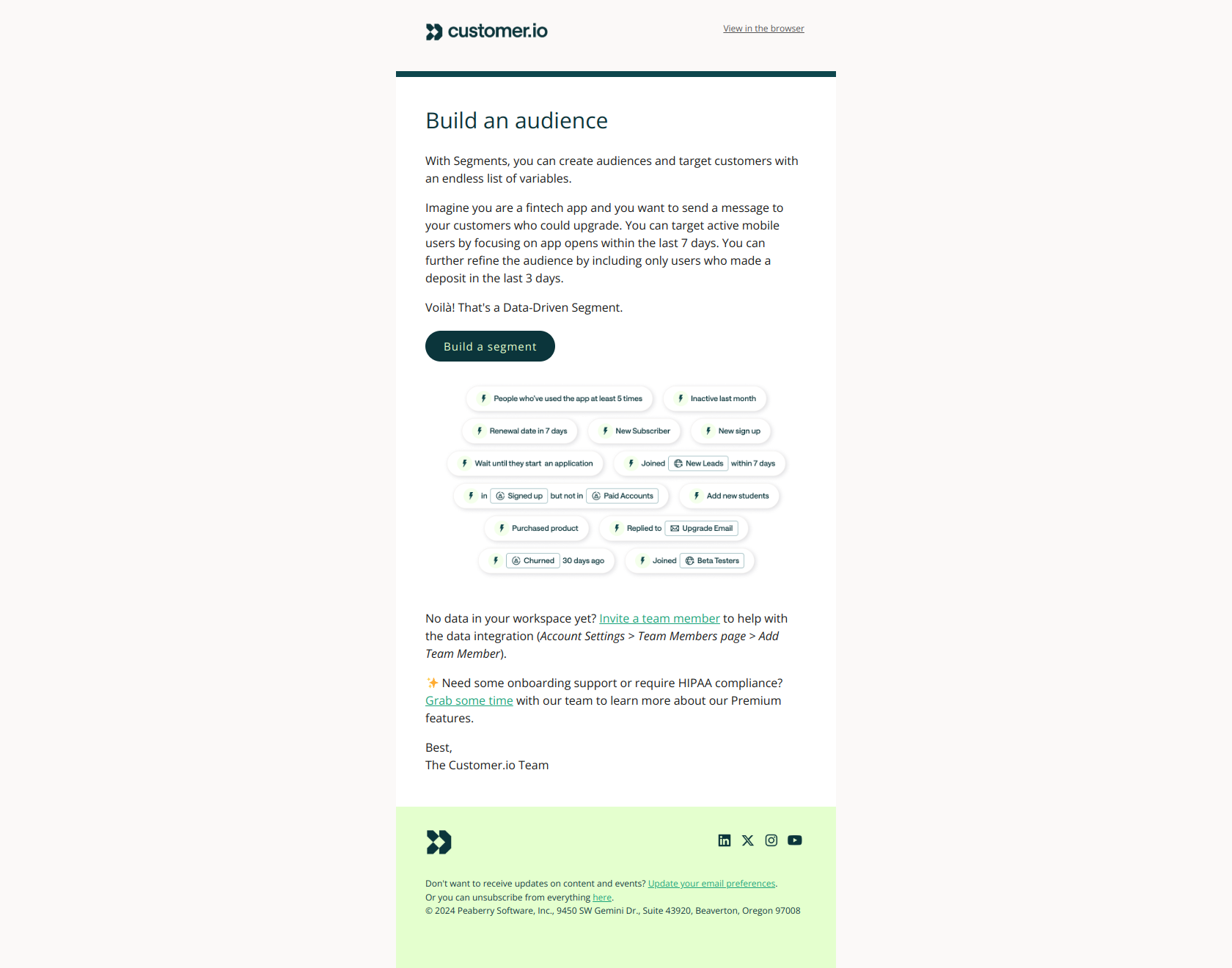
Pipedrive

Pipedrive’s welcome email is all about momentum. It opens with a clear, benefit-driven value prop (“your sales are in good hands”) and a visual of the CRM in action. The CTA is immediate and action-oriented: “Get started now.”
Below, it gives three easy steps to activate: customize pipeline, add a deal, invite teammates. The tone is confident but friendly—perfect for encouraging users to engage quickly without overwhelming them. A solid onboarding kickoff.
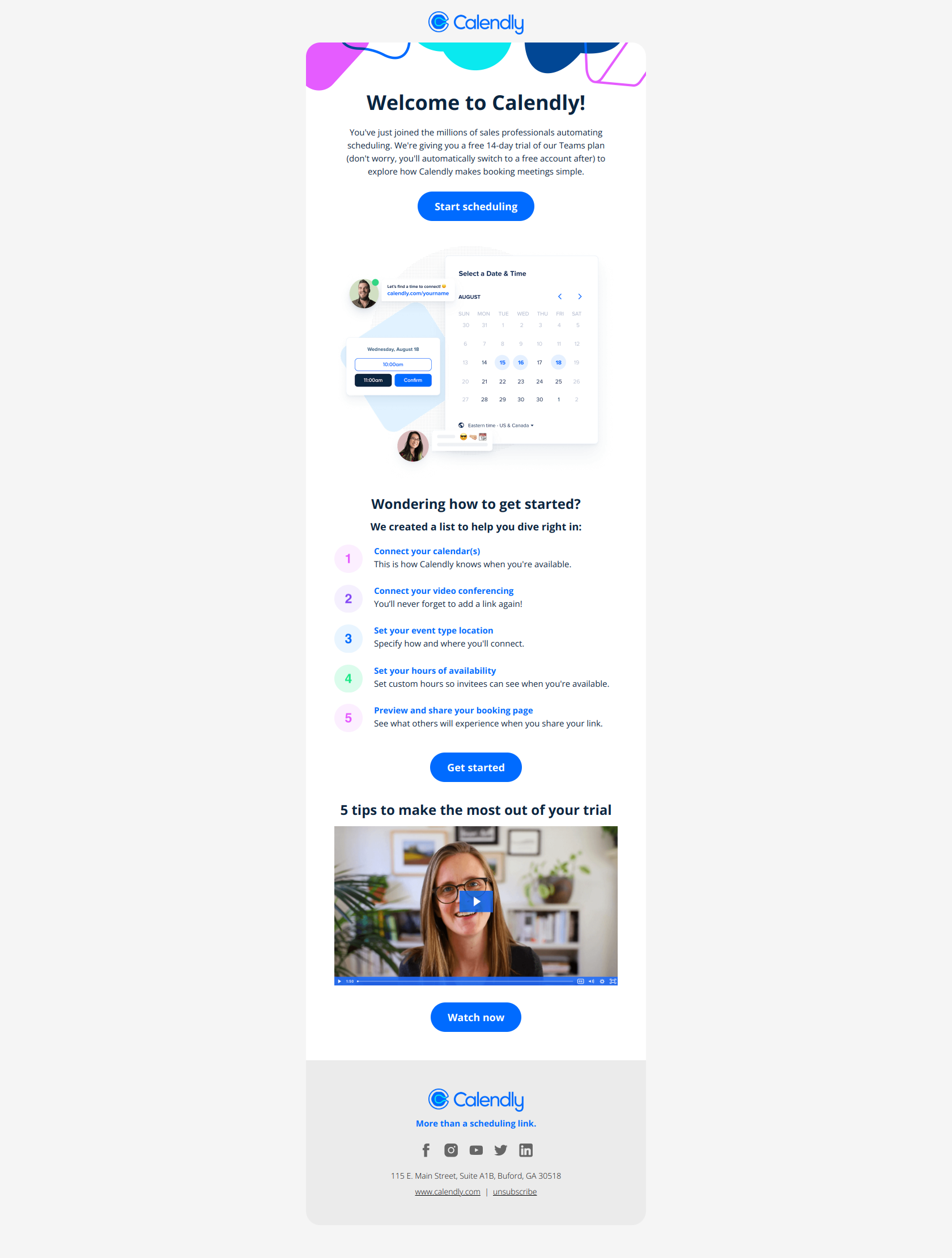
Calendly
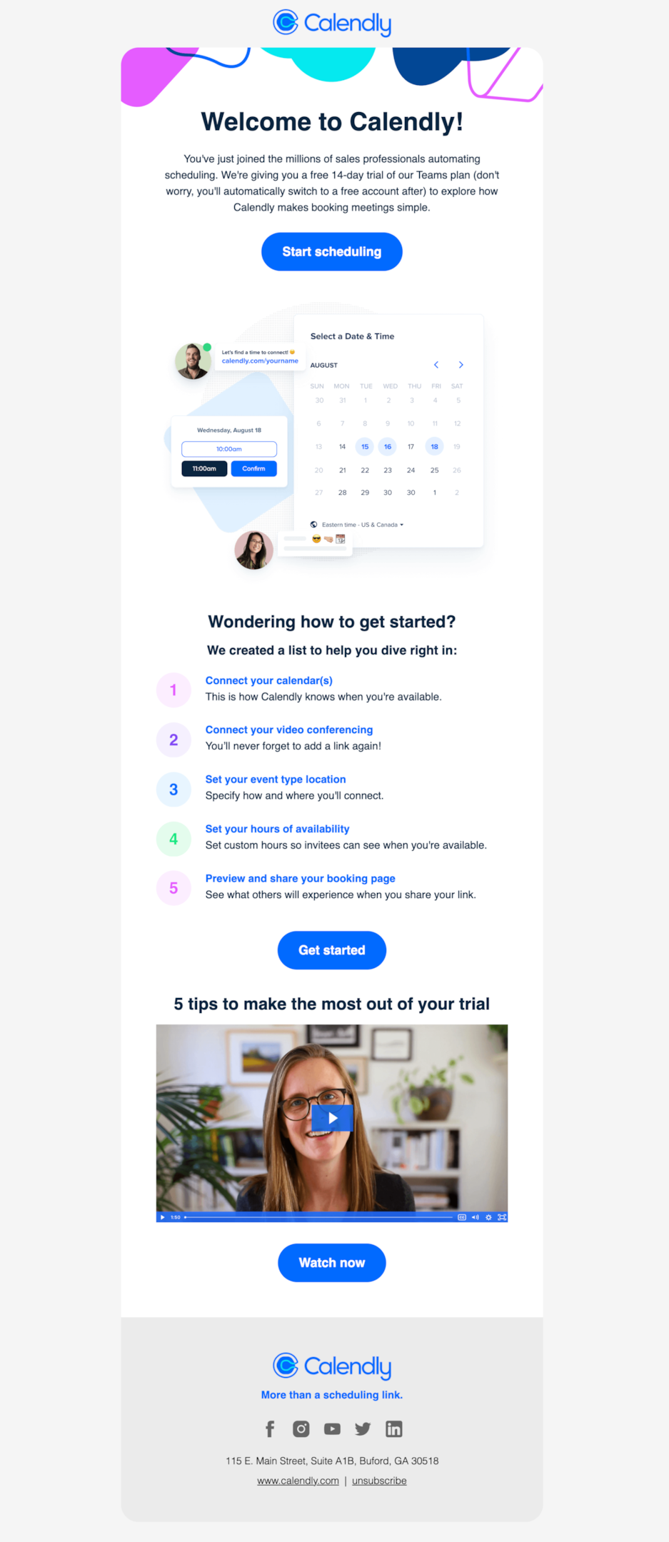
Calendly nails clarity and ease. The headline is warm and celebratory, while the subcopy immediately explains the trial and what to expect—no surprises, just smooth onboarding. The CTA “Start scheduling” is front and center, making next steps obvious.
The step-by-step guide below is super digestible and beginner-friendly, removing any friction. A short onboarding video at the bottom adds an optional deep dive. It's an upbeat, user-first email with zero overwhelm—exactly what welcome emails should be.
Miro

Miro’s welcome email is on-brand and visually immersive—feels like stepping right into a board. The headline is friendly and motivating, while the main CTA invites immediate action. Below, four quick-start tiles offer hands-on ways to dive in, from adding stickies to generating diagrams with AI.
It balances creativity and clarity, guiding users without overwhelming them. The final nudge—a call to “Check out Miro tutorials”—is a solid fallback for anyone wanting extra direction. Super beginner-friendly!
Loom

Loom keeps its welcome email refreshingly simple, mirroring how users typically share Loom videos—in quick, no-frills messages. The plain-text format and central embedded video highlight the product’s core value: fast, informal video communication.
By avoiding heavy visuals and focusing on utility, Loom subtly reinforces its own use case. It’s a strategic choice that aligns with user behavior, making the experience feel familiar and frictionless right from the start. Smart, purposeful, and perfectly on-brand.
Webflow

Webflow’s welcome email is clean, vibrant, and action-focused—true to its no-code brand. It quickly outlines two ways to get started: build from scratch for creative freedom or pick a template for a head start.
Clear links and gentle guidance invite users into the Designer with minimal friction. The tone is empowering, giving users confidence whether they’re total beginners or design pros. Support and inspiration are just a scroll away, keeping momentum high without overwhelming.
Notion
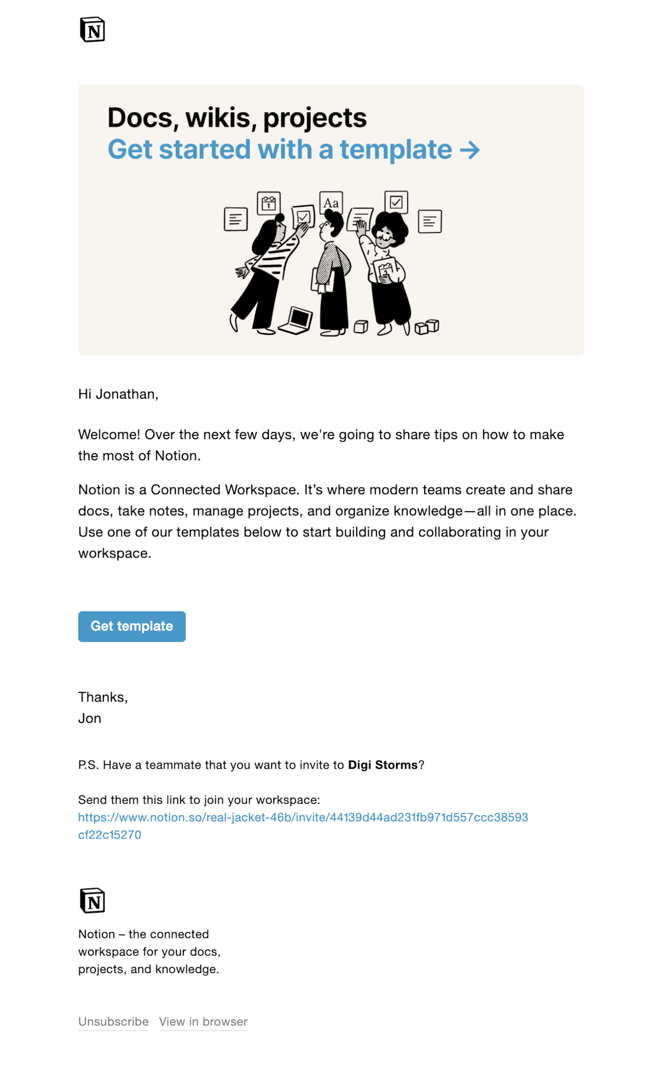
Notion’s welcome email is a masterclass in clarity—clean, minimal, and straight to the point, just like their product. It gently introduces the platform without overwhelming, nudging you to start with a template and highlighting what makes Notion powerful: docs, wikis, and projects in one connected space.
The simplicity of the message mirrors their interface—no fluff, just function. Bonus points for the friendly tone and quick invite link to get your team collaborating right away.
Apollo

Apollo’s welcome email mirrors its core use case—sales outreach—by going full plain text with a friendly, personal tone. It reads like a message from a real person, not a brand, which fits perfectly for a tool built around sending smarter cold emails.
Josh, your smiling Apollo guide, brings warmth and energy to the experience. With links to a quick video, a lead-gen webinar, and a demo, it delivers value fast. The “shoot me a hey” line keeps it human.
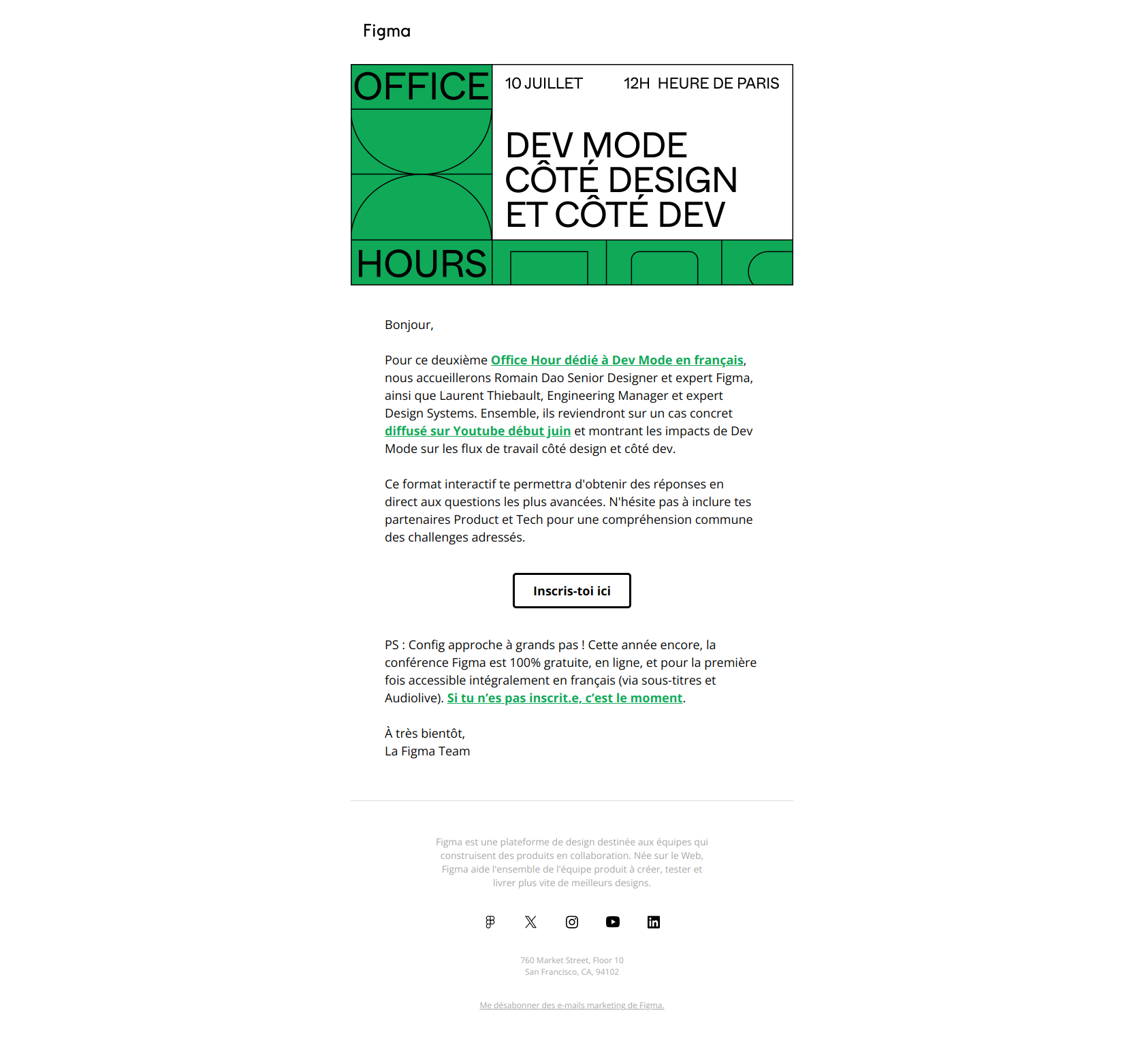
Figma

Figma’s welcome email feels just like its product—clean, creative, and playful. It opens with bold, colorful illustrations and a clear CTA to “create a file,” helping users get hands-on fast. Quick links to demos, templates, and app downloads keep the momentum going without overwhelming.
The layout is tidy, the copy is light and friendly, and everything centers on getting users to explore and collaborate. It’s a cheerful kickoff that mirrors Figma’s intuitive, design-first ethos.
Adobe Illustrator

Adobe Illustrator’s welcome email is bold, polished, and unmistakably on-brand. With dramatic visuals and slick typography, it instantly positions the user at the center of a creative journey. The call to “enter your golden era of design” feels grand, while links to tutorials, templates, and inspiration make that vision feel achievable.
It’s aspirational but grounded—balancing showstopping imagery with clear next steps. This is Adobe flexing its design muscle while helping new users hit the ground running.
Buffer

Buffer’s welcome email is calm, clear, and confidence-boosting—perfect for a tool designed to simplify social media. It opens with warm community vibes and quickly lays out the value of its 14-day trial, from analytics to scheduling to team workflows.
Joel’s friendly sign-off adds a personal touch, reinforcing the “we’ve got your back” vibe. It's structured, inviting, and beginner-friendly, easing new users into the platform while promising to help them grow—without the overwhelm.
Stripe

Stripe’s welcome email gets right to business—clean, structured, and ultra-practical. It mirrors the Stripe product experience: powerful yet simple. There’s no fluff, just a clear path to action—whether you’re building links, invoices, or complex checkout flows.
Each section is chunked to highlight value fast, with helpful links to go deeper. It's a masterclass in onboarding that empowers users to launch confidently, while reinforcing Stripe’s brand as the quiet engine behind modern payments.
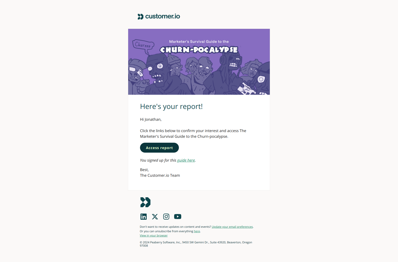
Customer.io

Customer.io’s welcome email is as practical as the platform itself. It jumps right into a three-step guide—connect data, build segments, and verify your domain—designed to help users unlock value fast during the trial.
Each section is clearly labeled with supportive links, making setup feel manageable, not overwhelming. The tone is straightforward and helpful, reflecting the product’s data-driven nature. A bonus: subtle touches like the “grab time with our team” CTA keep it human without overdoing it.
Lucidchart

Lucidchart’s welcome email is clear, vibrant, and action-ready—just like the diagrams it helps users build. The bold orange design and animated visuals draw you in, while the content keeps it crisp: what Lucidchart is, what you can do with it, and where to start.
A quick-start button, four practical benefits, and a nudge toward Lucidspark create a simple yet complete onboarding flow. It’s everything you need to get diagramming fast, with zero fluff.
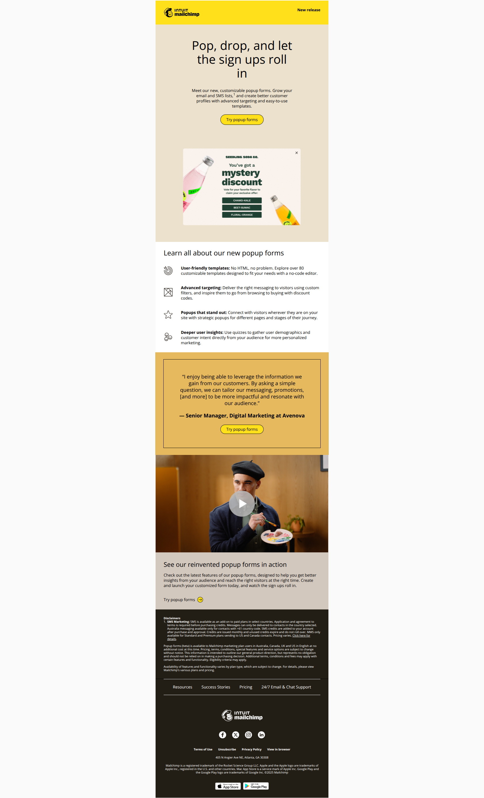
MailChimp

Mailchimp’s welcome email is bold, upbeat, and packed with energy—just like their brand. The oversized headline and yellow CTA button immediately set a can-do tone, while the copy promises support through setup, email sending, and tool integration.
Resources are clearly laid out with quick-start videos, webinars, and a free 1-month trial to explore paid features. It's a well-structured intro that balances inspiration and action, inviting users to dive in at their own pace while feeling guided.
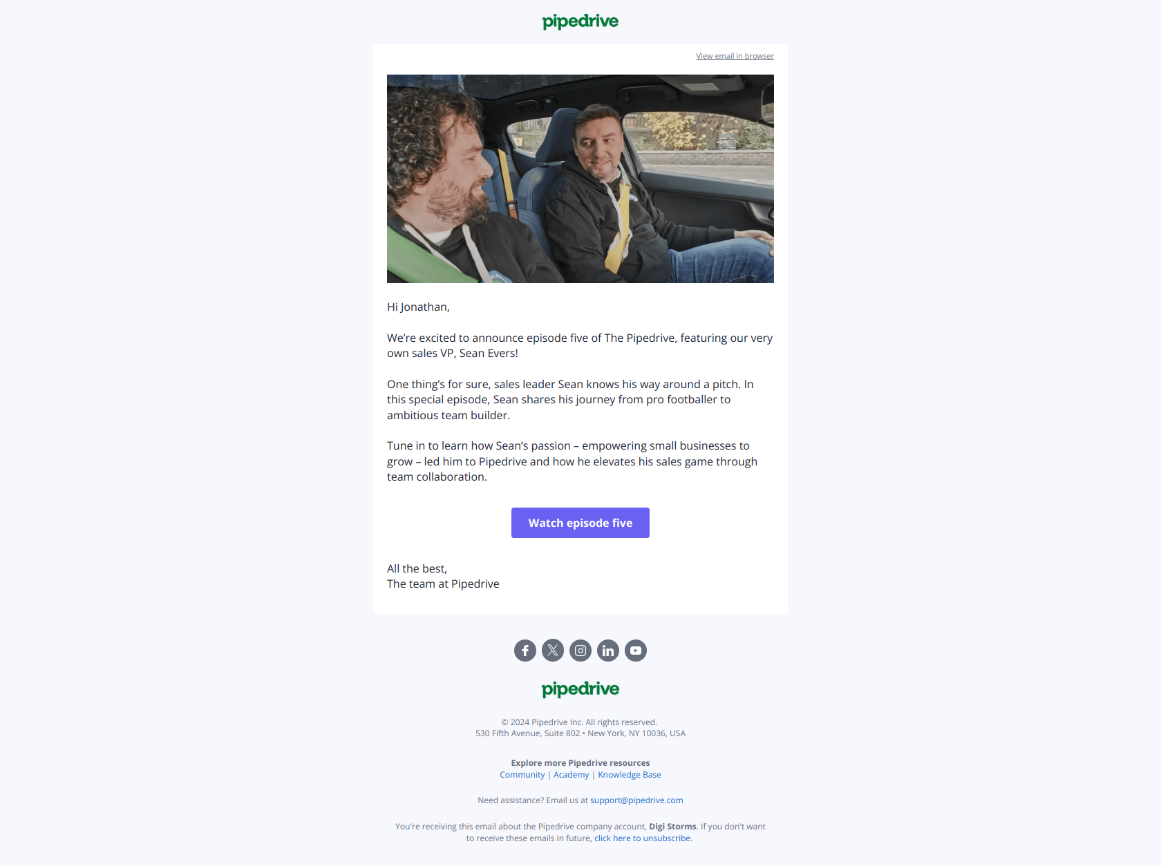
Zapier

Zapier’s welcome email is clean, focused, and packed with learning paths for every type of user. It kicks off with a cheerful “Welcome to Zapier, Jonathan!” and immediately offers a quick start guide—perfect for automation beginners.
The layout breaks down helpful resources into blog posts, videos, and webinars without overwhelming. It’s a choose-your-own-adventure for getting started, clearly designed for action. Every section nudges users toward value fast, staying true to Zapier’s mission: automate everything, with no fuss.
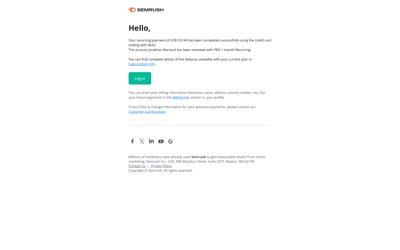
Semrush

SEMrush kicks things off with a confident “thank you” and a bold CTA, making it clear that the trial clock is ticking. The design is crisp, with bold purple blocks and orange accents, and the content gets straight to the point: start using the tool now.
It suggests bite-sized use cases—keywords, rankings, backlinks—to help users hit the ground running. This is a high-utility email that nudges you to act fast and make the most of your trial.
Fiverr

Fiverr’s welcome email feels vibrant and energizing—much like its brand. It opens with a warm, smiling face and a message that instantly positions the user as having unlocked a world of opportunity.
The copy is motivational and action-oriented, guiding users toward top services like logo design and blog writing with big, bold visuals. It’s all about sparking momentum. The email nails the “you’ve arrived” vibe, inspiring confidence and curiosity from the very first scroll.
Google Workspace

Google Workspace’s welcome email is as clear and structured as you’d expect. It leans into its utility-first identity with a crisp layout, checklist visuals, and helpful links guiding users through setup. There’s no fluff—just a clear invitation to verify your domain, explore quick start resources, and unlock productivity.
The green progress bar subtly motivates action, while the clean design reflects the brand’s professional, no-nonsense vibe. It’s like a calm, confident onboarding coach pointing you in the right direction.
Hunter

Hunter’s welcome email is clear, functional, and straight to the point—just like their product. It centers around the Email Verifier with a live demo screenshot that immediately shows you what the tool does.
There’s minimal fluff, just a crisp explanation, a confident CTA (“Try it now”), and a friendly nudge about their Campaigns feature. The tone is reassuring and helpful, with a strong emphasis on trust and deliverability—exactly what you want from a tool focused on email verification.
Docusign

DocuSign’s welcome email is all about clarity and confidence. It gets straight to the point with a simple headline, clean layout, and clear benefit breakdown. The tone is calm and professional, matching the serious nature of what they handle—contracts and signatures.
The visual of someone at work reinforces that “get stuff done” mindset. With just one bold CTA and a helpful bullet list of features, it’s focused, tidy, and built for immediate action.
Lemlist

Lemlist’s welcome email closely resembles Apollo’s—and it totally makes sense. Both tools are rooted in outbound sales, so their emails lean into that same scrappy, personal vibe their users send to prospects.
It feels like a real person (in this case, Kévin!) reaching out directly, photo and all, rather than a polished brand broadcast. That friendly, casual tone instantly builds trust, which is crucial in cold outreach—and sets the tone for how Lemlist wants users to show up too.
Freepik

Freepik’s welcome email is bursting with energy—bright visuals, fun copy (“hello there!”), and a confident rundown of all the creative goodies waiting for you. It’s designed to spark excitement for what you can make, with helpful feature highlights like filtered search, collections, and the handy copy-to-clipboard tool.
It’s essentially saying: “we’ve got the tools, now go create something awesome.” The tone is playful and inspiring, which fits perfectly for a design-focused resource platform like Freepik.
Crunchbase

Crunchbase’s welcome email feels surprisingly bland for such a powerful and well-known platform. While simplicity can work when it aligns with the brand (like Apollo or Lemlist), here it just comes across as generic and forgettable.
There’s no visual storytelling, no UI preview, and barely any personality—just plain text and links. For a data-rich tool that helps users explore dynamic company profiles, the email lacks the spark to reflect what makes Crunchbase special.
Zero Bounce

ZeroBounce’s welcome approach is a double-edged sword. On one hand, it’s genuinely refreshing to get a personal note from a real person—Ciprian’s message feels warm, proactive, and helpful. But without a proper branded welcome email to accompany it, the whole experience feels a little unfinished.
A designed touchpoint would build trust, showcase features, and reinforce the brand. The combo of both would be ideal: personal outreach for connection, and great design for clarity and confidence.
OptinMonster

OptinMonster’s welcome email definitely brings the enthusiasm—and a ton of words. While it’s friendly and packed with helpful resources, it borders on overwhelming. The mix of video, guides, future email teases, and personal touches from the founder is thoughtful, but the message could be much tighter.
A clearer layout and a bit less copy would go a long way in improving scannability. There’s great content here—it just needs some breathing room to shine.
PhantomBuster

PhantomBuster’s welcome email strikes a nice balance—it’s simple, clear, and focused on quick wins. The ghost emoji adds a fun brand touch without going overboard. The layout is tidy, and the call to action is strong.
It points new users directly to popular LinkedIn tools while offering help through webinars or replies. It’s not flashy, but it gets the job done efficiently, which fits a power-user automation tool. Clean, helpful, and easy to act on—well played.
Motherduck

MotherDuck’s welcome email nails the playful tone without sacrificing clarity. The background illustrations add a fun visual pop, and honestly, the duck mascot is just adorable—hard not to smile at that.
It keeps the vibe light while still pointing you to useful links like the video tour, Slack community, and docs. It’s a solid example of how a little brand personality can go a long way in making onboarding more delightful. Quack on, team.
Wordware

Wordware’s welcome email skips the gloss and goes for a more human, scrappy feel—which totally works for an early-stage AI product. It reads like it came straight from the founder’s keyboard, which makes it feel personal and approachable.
There’s no flashy design, but that’s part of the charm. It reflects a team focused on building and shipping rather than polishing. For a product still finding its stride, this kind of honest, clear communication hits just right.
Building welcome email templates like these top brands
Great welcome email templates don’t just happen—they’re built with intention.
The best SaaS companies craft emails that guide, not just greet.
They focus on clarity, value, and a seamless entry point into the product. If you’re using templates, think of them as frameworks, not fill-in-the-blanks. The tone, structure, and CTAs need to align with your product’s flow and the mindset of a new customer.
💡 Top brands start by reinforcing their core value within seconds—often in the headline. They highlight one or two key features that match early user intent, followed by a clear call to action that creates forward motion.
These emails aren’t trying to say everything. They’re opening a door and pointing to a first win.
The examples we’ve shown earlier reflect this mindset. Whether it's a minimalistic layout or a more branded experience, the content stays focused and user-first.
The takeaway? Don’t overthink design, but never phone in the strategy. A great welcome email template delivers confidence and direction. It should make new users feel like they’re in the right place—and ready to take the next step.
Crafting a great subject line that actually gets clicks
The subject line is your first impression—and your one shot at getting opened.
For SaaS welcome emails, this line needs to be clear, timely, and rooted in your product’s value. You’re not trying to be clever for the sake of it. You’re trying to earn attention in a crowded inbox.
Skip the vague stuff. A great subject line might tease a key feature, reinforce the user’s progress (“You’re in!”), or highlight what’s next.
It should reflect what’s inside the email—not bait-and-switch. Bonus points for adding clarity without sounding robotic.
New users respond to momentum. Use that. Subject lines like "Start building your first campaign" or "Get your workspace set up in minutes" guide the user mindset while triggering curiosity.
Keep it short. Keep it specific. And test often. The best performing subject lines are often the simplest—especially when the content behind them delivers real value.
One thing top SaaS brands have in common? They treat subject lines as part of the onboarding flow, not an afterthought. If you get this right, it sets the entire lifecycle in motion—from the first open to future behavior based emails.
Keep your message clear, focused, and easy to scan
Your welcome email isn’t a brochure—it’s a starting point.
New users are scanning, not studying. You’ve got maybe 10 seconds to communicate value and direction, so clarity matters more than cleverness.
Start with a strong headline that reinforces your product’s core value. Then structure your body content around quick, easy wins.
Use short paragraphs, bulleted lists, and plenty of white space. Design-wise, keep the layout clean and mobile-friendly—because that’s where a lot of users will read it.
This is where many email templates go off the rails. They try to do too much, introducing every feature instead of just the ones that help new customers make progress. The best SaaS welcome emails feel like a guided path, not a wall of text.
A good rule of thumb: one core idea, one CTA. Avoid clutter, jargon, and over-explaining. Let your product do the heavy lifting later—your job here is to make getting started feel easy.
Your new user doesn’t need to know everything. They just need to know what to do next.
Craft clear call to actions that guide your new customers
A welcome email without a clear call to action is a missed opportunity.
Every SaaS onboarding email should include one job to be done—and that CTA should make it unmistakably easy to act.
💡 Whether it’s “Start a project,” “Add your first teammate,” or “Explore templates,” the best calls to action are direct, benefit-driven, and specific to the user’s current stage. Avoid vague phrases like “Learn more” or “Click here.” Your CTA isn’t just a button—it’s a guided step in the journey.
This is where behavior based emails shine, too. If you already know what your new customer has (or hasn’t) done, you can tailor CTAs based on that.
Has the user installed the app? Push them to integrate. Haven’t verified their email? Give them one click to complete it.
Design also matters. Your CTA should stand out visually but not scream. Use contrasting colors, whitespace, and positioning to keep it noticeable without being aggressive.
At the end of the day, your welcome email should leave zero ambiguity around what happens next. Clear beats clever. A well-placed, well-written call to action turns passive readers into active users—fast.
Let your SaaS welcome email be the beginning, not the peak
A strong welcome email is the start of your relationship with a new user.
It sets the foundation for trust, momentum, and long-term product engagement. But even the best welcome email can’t do it all alone. It needs to work in sync with your broader onboarding strategy.
Think of your welcome email as the first step in a series of behavior based emails that evolve with the user.
As they explore features, hit roadblocks, or go inactive, your messaging should adapt. That’s how you stay relevant—by matching intent, not just stage.
The goal is to activate, not just inform. That means every line of your email—subject, headline, copy, CTA—needs to nudge users toward meaningful action. Not flashy. Not overwhelming. Just clear, purposeful communication.
If your welcome email delivers a quick win, reminds users of your core value, and guides them into the next step, you’ve already done more than most. Keep it focused, helpful, and human.
Because when done right, a great welcome email doesn’t just say “hello”—it starts a journey.
Want help crafting welcome emails that drive action? Let’s connect
If you’re ready to level up your onboarding flow, I’d love to help.
Whether it’s refining your welcome email templates, building behavior based sequences, or just finding the right CTA for new users—I’m here for it.
Let’s craft emails that actually move people. Book a strategy chat anytime.
.png)

